This 2 parts tutorial will show you how we came up with a new symfony sfForm widget to handle many-to-many relationships. In our specific case, existing widgets for such relationships were found extremely unuser-friendly to say the least, we had to think about a new widget to help our users in their daily operation.
We do not pretend that our solution is the best in all user-cases but it is definitively a better approach when you have a lot of potential items to associate with your current object and a short list of associated items; the relationship between a classroom and students for example: you have a class of students (the class is less than 40 students usually) within a University of thousands of students.
The default widget
I have always been very skeptical with the default widget in symfony form framework for many-to-many relationship. In a UI perspective it was really bad:
- You have to "shift-click" in a multiple select box the item you want to add to your relation,
- if you have a long list, it is very inconvenient to find the one you want,
- if by mistake you click without the shift button pressed, you are good to start over your multiple selection
I guess you can see the picture ;-) Talking about the picture, here is one to show you what I am talking about.

The double list widget
When you start to look around for a better replacement, you obviously find the plugin sfFormExtraPlugin which includes the widget called sfWidgetFormSelectDoubleList and you get something like this:

This is already a big improvement but still has some huge limitation when you are dealing with big lists (I am thinking here stuff like list of students in a University). You do not want to have a select box with thousands of options: 1) it is going to slow down your page and 2) it is not easy to search inside.
A double list enhancement
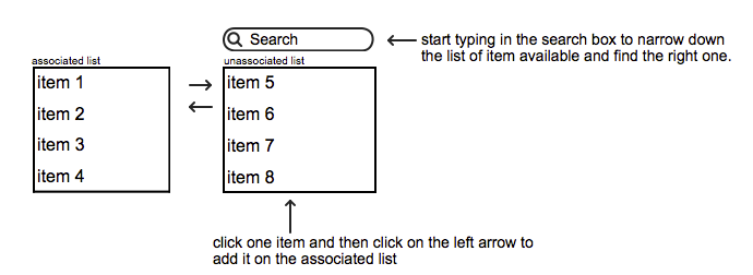
The first "natural" step could be to improve an existing widget. In our case, the best is so far the double list widget mentioned earlier. An easy way to improve it could be to add a search box on top of the unassociated select in order to easily narrow down the list and find what we are looking for. We could even imagine a similar search box on top of the associated list to add a little bit more flexibility too. Anyway, here is a mockup that explains all this:

This could be already a huge improvement, although I can see still some limitations, namely: 1) you still load a huge list of unassociated items, 2) when you start filtering with your search, you need to select the desired item and then click on the left arrow, this is a bit too much interaction.
Anyway such a widget would be a huge improvement already and could be used in many cases, but let's not stop here...
Thinking forward
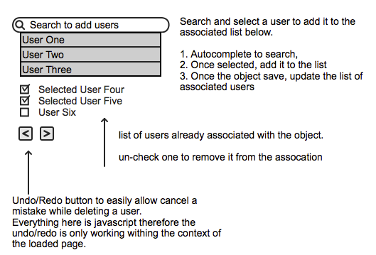
We came up with a mockup that suits our needs. I acknowledge that it cannot fit all needs, it is good to list a short list of relations -usually list of student in a class is under 40 and add new students among a huge list.

You basically search in an autocomplete box (ajaxified) to find the item you want to add, click the right one in the list and it is added to your checked list below. The all list is saved once you save the current form object. If you uncheck one item it will be removed from the list (with some delay to allow you to change your mind in case of a mistake). Finally we could add a local undo/redo function in case of mistake.
In terms of interaction, you type in your searched word, select from the list (click or enter) and you are ready to add another. I believe it can help a lot end users.
This symfony widget does not exist as far as I know therefore next part of this tutorial will focus on the code to make it a reality.
Conclusion
The first thing I'd like to claim: "multiple select" is BAD! At least I could not find a user-case where it could be a good solution, therefore avoid it as much as you can.


